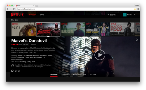
The app like design provides consistency across platforms, including mobile devices
 EDMONTON, AB Jun 16, 2015/ Troy Media/ – After four years, Netflix has finally decided that it was time for an overhaul of their website. Gone are those cascading box shots that scrolled right to left like moving sidewalks at the airport. They’ve been replaced with an interface that resembles a more modern app experience than a traditional series of webpages.
Now to be fair, the site was pretty cool when it was originally designed, but four years in technology is a pretty long time. The company says that it has redesigned to take advantage of the availability of more sophisticated technology that allows for richer visuals and animations. The app like design makes sense by providing consistency across platforms as more people watch Netflix on their mobile devices including smart phones and tablets. Read Full Post at Troy Media.


Speak Your Mind